Thursday 25 February 2010

NME Article


Depending who the feature artist is then the target audience will resolve around them, so the target audience will differ based on who is the feature artist. Basically if the feature artist is a Pop star, than their target audience will be fans who are interested in pop music. The choice of feature artist will be very important to attract the correct target audience. The type of language used is quite informal, there isn’t any need to have much academic quality, and most people will be able to read this article. Obviously because the article is written in English, it is aimed for people who are able to read English. This language appeals to the target audience as it is easily understood. “As all dead rock stars know” if this line was in another article it could be taken from a different aspect for example, if it was in a newspaper, then it would have a completely different concept, it would be seen that a rock star had passed away. Another example is “Fuck it, we’re gonna pretend like all this isn’t happening for a hot minute” as this was said by a rock artist is would be over looked at his fowl language however if the same expression would have been said by a politician in newspaper than the article would be seen as a bad representation for him/her, but because rock stars already have this image, so this doesn’t affect their status. I think that the tone that the magazine uses to address the reader is an informed intelligent fan, because although they speak with formal language they can be informal and relate to the target audience because but they also have are intelligently informed. They know the factual information about the band also. The text style of the text is plain, easily eligible, but is really small. All the other pages have similar fonts. The titles are a bigger font size than the font size of the article. The layout of the page is very organised as the text are assigned in columns meaning that the article is easily read and looks very presentable. One whole page is taken up with an image, with a quotation from the article. The next page is taken up by at least three quarters of the page with at least font size 72 which is another quotation from the article, this text is aligned to the centre of the page making it stand out more, also each line has a different font colour one line is a light green the other is a dark green. Then the interview begins with a brief opening paragraph, that doesn’t have any alignment and is approximately font size 16. Underneath this section the name of the person who has written this article is aligned to the right. The interview is then split into two columns that look as if it is in the middle of the page, the font size is rather small, and the article begins with a capital ‘A’ that is much bigger than the size of the other text. For the next two pages the article is split into three columns, one page has an image that takes up at least one quarter of the page
The tone that the magazine is using is that they are an informed intelligent fan, this is easily displayed because the text is formal, and if it was by a close friend or a member of in crowd then there will be some kind of slang words used. Through the image the artist is represented in a fun, quirky way. The images of him in the photo booth and the images it’s self. His fashion style is very Goth like. There aren’t any captions for the images. The images themselves are action shots, as if he was in the middle of doing something. There is also a shot of him performing at a concert.The only thing that is similar to the house style is the fact that the magazine title is at the bottom of the page. There is also some sort of similarity with the contents page and the article, because some of the words are in a coloured box.

Friday 12 February 2010

My Title Blocks


Analysing Title Blocks

Kerrang!

The target audience for Kerrang magazine is 15-25 years olds who are interested in to rock/punk/grunge/ indie music. More males read this magazine than women. The publisher of the magazine is Bauer. This is a niche music magazine and from the front cover I can tell that there will a lot about bands and music inside. They have a range of bands and artists; this is so they can attract a wide range of audience. The title is bold and black as it made to stand out and make a statement. The word Kerrang is the sound that a guitar makes when it is struck really hard, this is known as onomatopoeia. The exclamation mark helps to emphasize the sound, make it seems as if it is really loud. The design of the block title tells me that the magazine is quite edgy. This is because the title looks like it has been smashed. It has the effect of a smashed glass or mirror which is quite edgy and again alternate. Showing the recklessness and loudness of the rock music also including their many sub-genres. The font type looks similar like graffiti and looks as if it has been stamped on to the page making it seem as if the name is being branded and will be able to be easily recognized, this gives an informal representation of the magazine. The colour scheme of black and white and the fort type portrays and image of roughness, edginess and uniqueness, which can be easily stereotyped throughout the audience. The white background helps the black font stand out but contrasts with the image as it can be mistaken for a formal text.

Rolling Stone

The target audience for Rolling Stone magazine are people from the age group 18-40. This magazine is devoted to people who enjoy music, politics and popular culture. The font used for this main stream magazine looks very classy and stands out due to the bold red colour and the white and black outline. This American magazine has a celebrity that it hot at the moment on the front cover to draw in the readers. Much like a tabloid newspaper, the title block is red making it stand out and possibly indicating that the information given is slightly more biased. The writing is really curvy and rounded joining together at some points making it look as if it could be a laid back image, as the magazine is easy going on what is published. The fact that all of the title has a dark shadow makes it stand out more. For some reason the font reminds me of an American dinner from the 60’s also from the band.


NME

NME, which is abbreviated from New Musical Express, is aimed for teenagers from 16-19 who are interested in indie/rock music. The publishing company for NME is IPC. This is a rebellious newspaper that started out as a newspaper but is slowly braking out to become a magazine. The magazine includes youth culture and what is the popular music at the moment. Not only does the red colour of the font match a tabloid newspaper the articles published are also like tabloids as they are much more like a gossip magazine. The font stands out as it is bright red. However it looks as if it is indented into the magazine as there is a darker shadow around the harsh edges, giving the wording some depth. The font type is kind of basic, but it is bold and capitalised making it stand out. Q

Q magazine is for music lovers from the older generations, who buy CD’s rather than downloading music. It is a sister magazine to Mojo, both are published by Bauer. This magazine includes in depth interviews and new released and up and coming talent. The magazine gives away promotional gifts such as cover mounted CD’s or books. The font type looks as if it is the classic “times new roman” making the title look formal as it is only one letter it is short and sweet and easy to remember. What does Q mean, the font style is very formal so does it mean, Queen or maybe it could mean Question as the questions that people have on the music industry can be answered in this magazine.

Thursday 11 February 2010

Friday 5 February 2010

Proposal and Questionaire

The genre of the magazine that I will be producing will be newly released or up and coming music. The audience will vary with their interests in all music types and would like to be able to have in-depth interviews. The age group of the audience should be from 18-25 a more older audience as the most of the magazines are targeted for younger generations. This magazine will be aimed for females as although there are many glamour or fashion magazines that are aimed at mainly women, there are not many music magazines targeted for them.

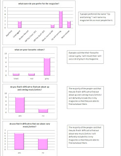
This is a questionnaire that I have produced so that I can find out what will attract my target audience to buy my magazine. Please circle what answer applies to you.

1. How often do you buy magazines?
Everyday Once a week Once a fortnight Monthly
When something interesting is inside
2. How much are you willing to spend on a magazine?
£1 or under £2 or under £3 or under £4 or under Over £5
3. What attracts you to magazine?
Freebies Celebrities Posters Interviews Competitions
Exclusive features Reviews Articles Clothing
4. What do you prefer in-depth interviews or factual information on artists?
In-depth interviews Factual information Both
5. Can you suggest a name for the magazine?
...............................................................................
6. What is your favourite colour/s? (no more than two)
................................................................................
7. Do you find it difficult to find out about new music or artists?
Yes No
8. Do you find it difficult to find out about up and coming music or artists?
Yes No

Thursday 4 February 2010

Preliminary Task

Front Cover.


Contents Page.